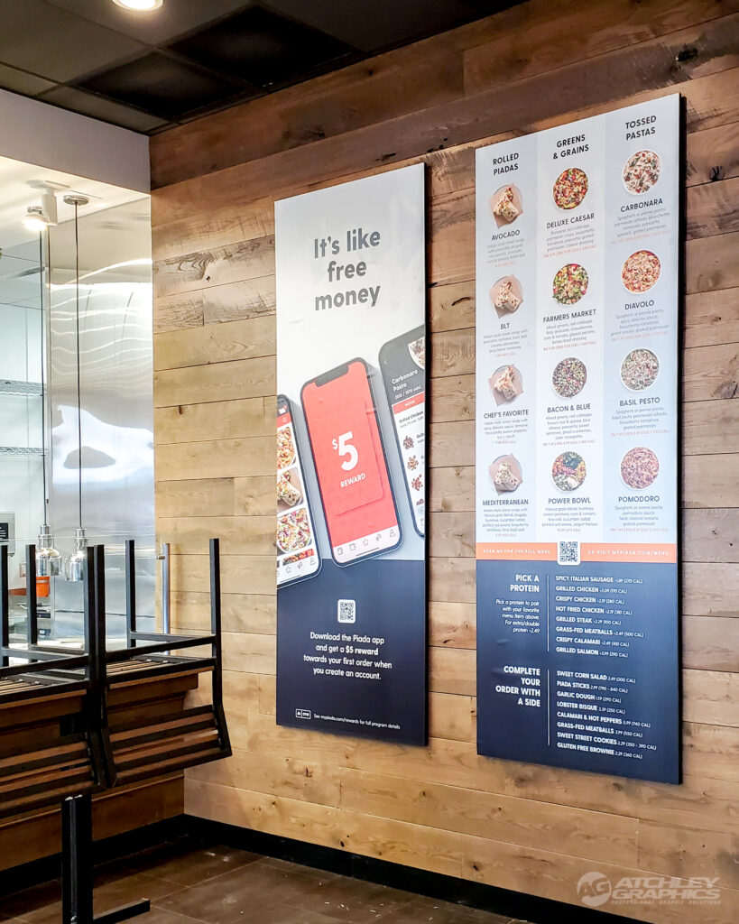
Creating a restaurant sign is essential to establishing your business and attracting customers. However, a well-designed sign can be the difference between success and failure, so it’s necessary to get it right. This blog post will provide tips on designing the perfect restaurant sign to help your new restaurant succeed. From finding the right font to choosing the right colors, these restaurant sign design tips will help you create a recipe for success.
Keep it Simple

When designing the signage for your new restaurant, it’s essential to keep the design simple. A too-busy or cluttered sign can be hard to read and understand. Keeping the design clean and minimal will make it easier for customers to identify your restaurant quickly. Use fewer colors and fonts, and avoid using too many decorative elements. The main goal is for the sign to be attractive but also legible. Additionally, you should ensure the message is clear and concise so customers can easily remember it. For instance, if your restaurant specializes in a particular cuisine, ensure this is featured prominently on the sign.
Consider the Location
When it comes to designing signage for your restaurant, the positioning of your sign is as significant as the design itself. It is vital to carefully pick the perfect spot for your sign to be visible to possible patrons. The kind of signage needed varies based on the type of eatery that you own. For example, a bold neon sign may be more fitting in a busy area where many people pass by. At the same time, a banner may be more effective in a place with limited visibility. Furthermore, it is necessary to consider the kind of customers you are attempting to attract and the atmosphere you aim to establish when choosing where to place your sign.
Be Creative
It’s important to think outside the box when developing a sign for a restaurant. Customers will be drawn in by an eye-catching design that stands out. Consider using unconventional shapes or fonts, different colors, and unexpected images. Try to create a recognizable and memorable sign so people will remember your restaurant even after they’ve left.
Incorporating your restaurant’s logo into the design can give your sign a professional look. In addition, you can add interesting details, like quotes or humorous sayings, to make your sign stand out. If you have limited space, consider going for a simple but impactful design rather than cramming too much information onto the sign.
Work With a Professional Sign Company
Developing an eye-catching, legible, and branded signage design for your restaurant can be arduous. Therefore, you must partner with a professional sign company to guarantee that your signage will succeed. An experienced professional can generate a unique design that will make your restaurant unique amongst its rivals. Teaming up with a professional will guarantee your restaurant’s signage is practical and appealing. Their proficiency and inventive ideas will help you produce the perfect sign to make your restaurant stand out.

